Reiji- Branding

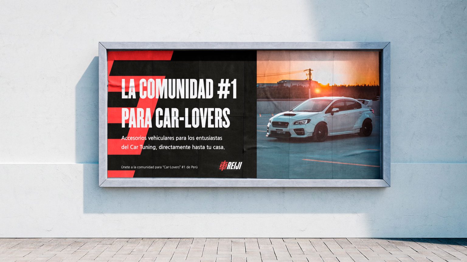
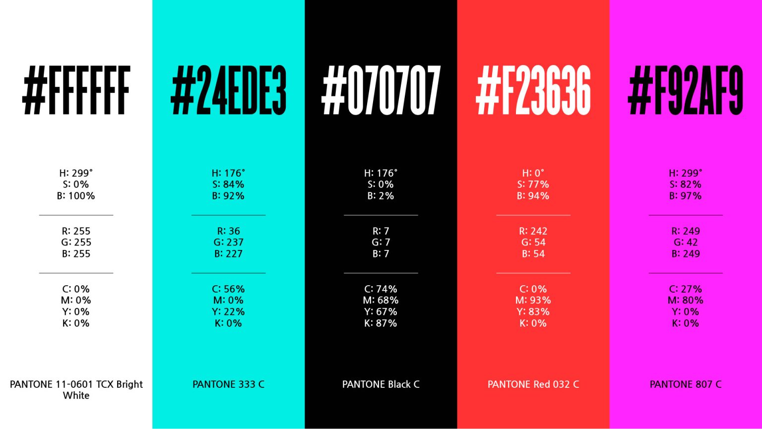
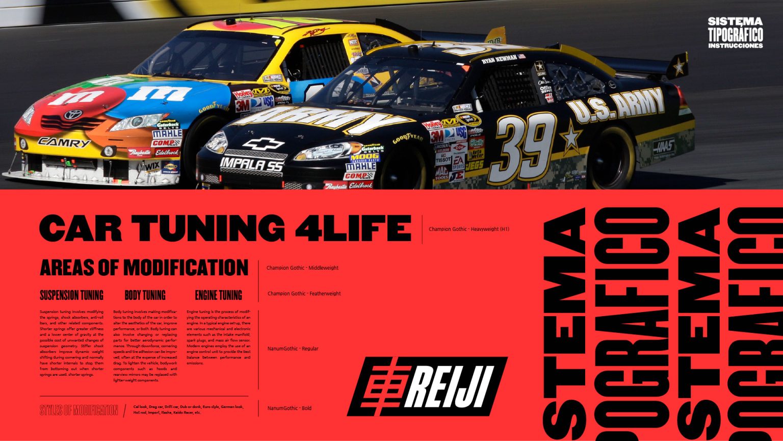
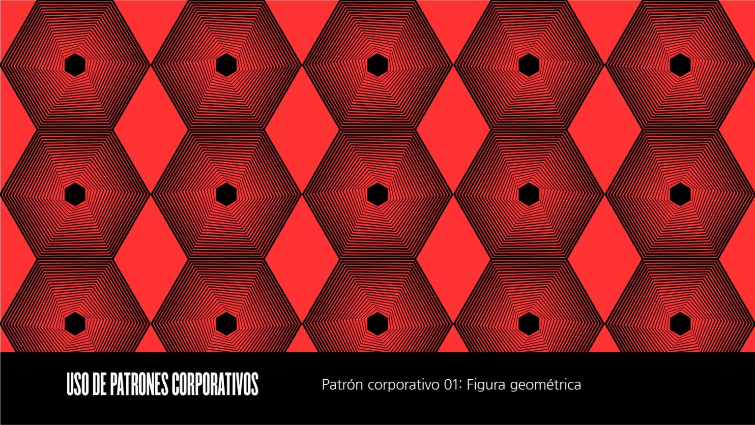
A comprehensive brand identity for Reiji, an emerging automotive tuning brand in Peru, positions it as a dynamic and trustworthy leader for male car enthusiasts aged 25-34. The new branding strategy, built on market and netnographic research, translates the energy and passion of car culture into a visual identity that conveys speed, modernity, and competitive performance.


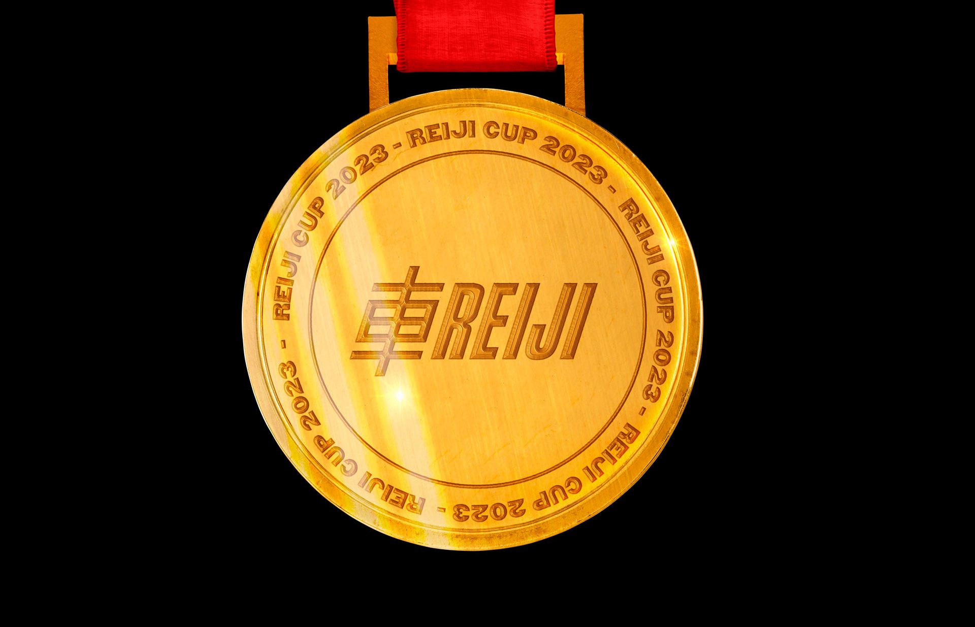
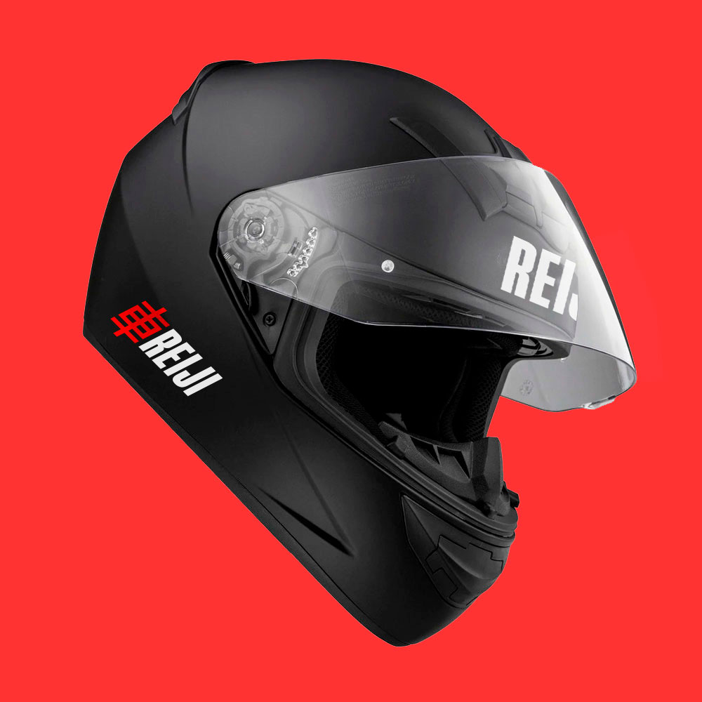
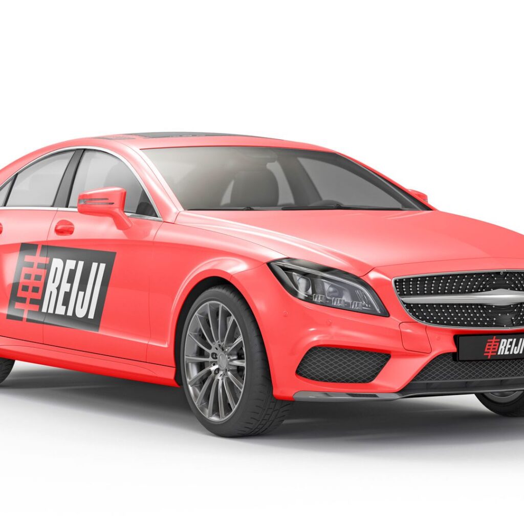
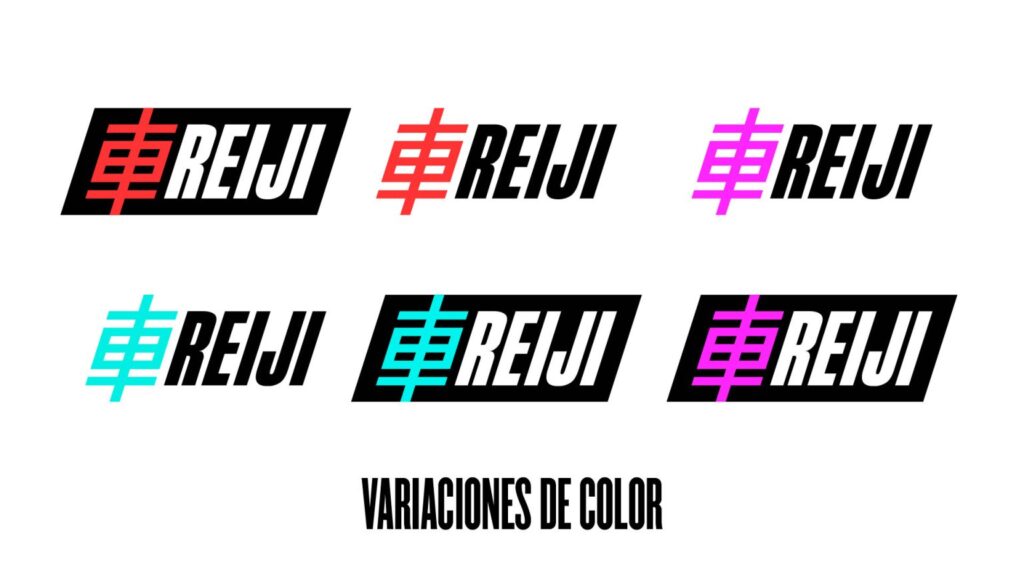
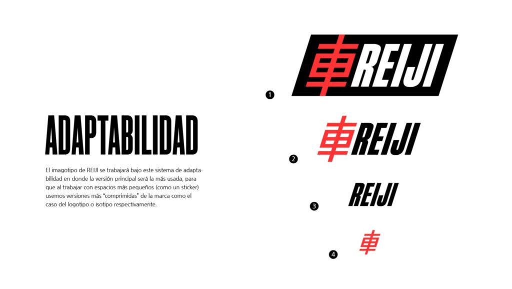
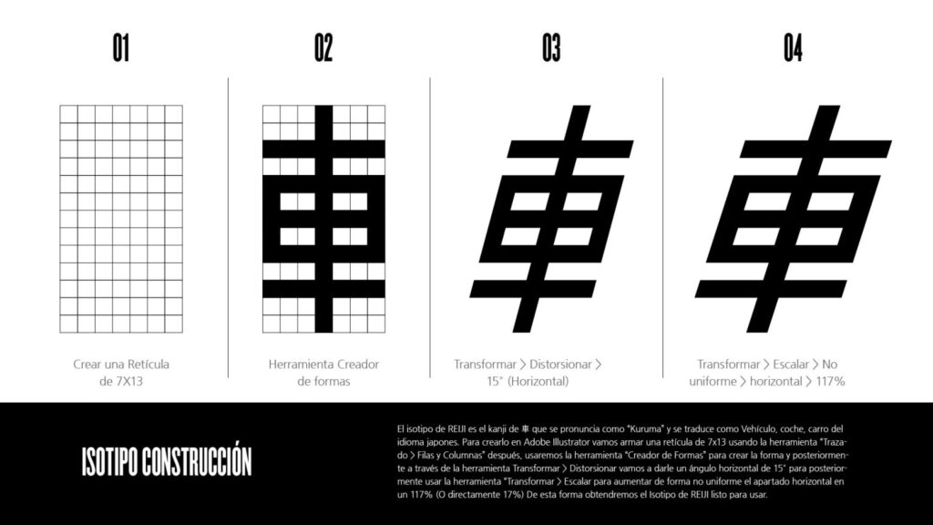
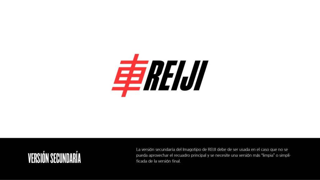
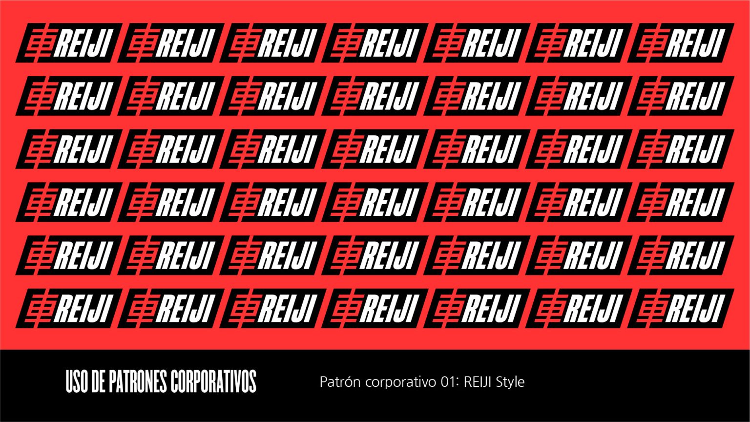
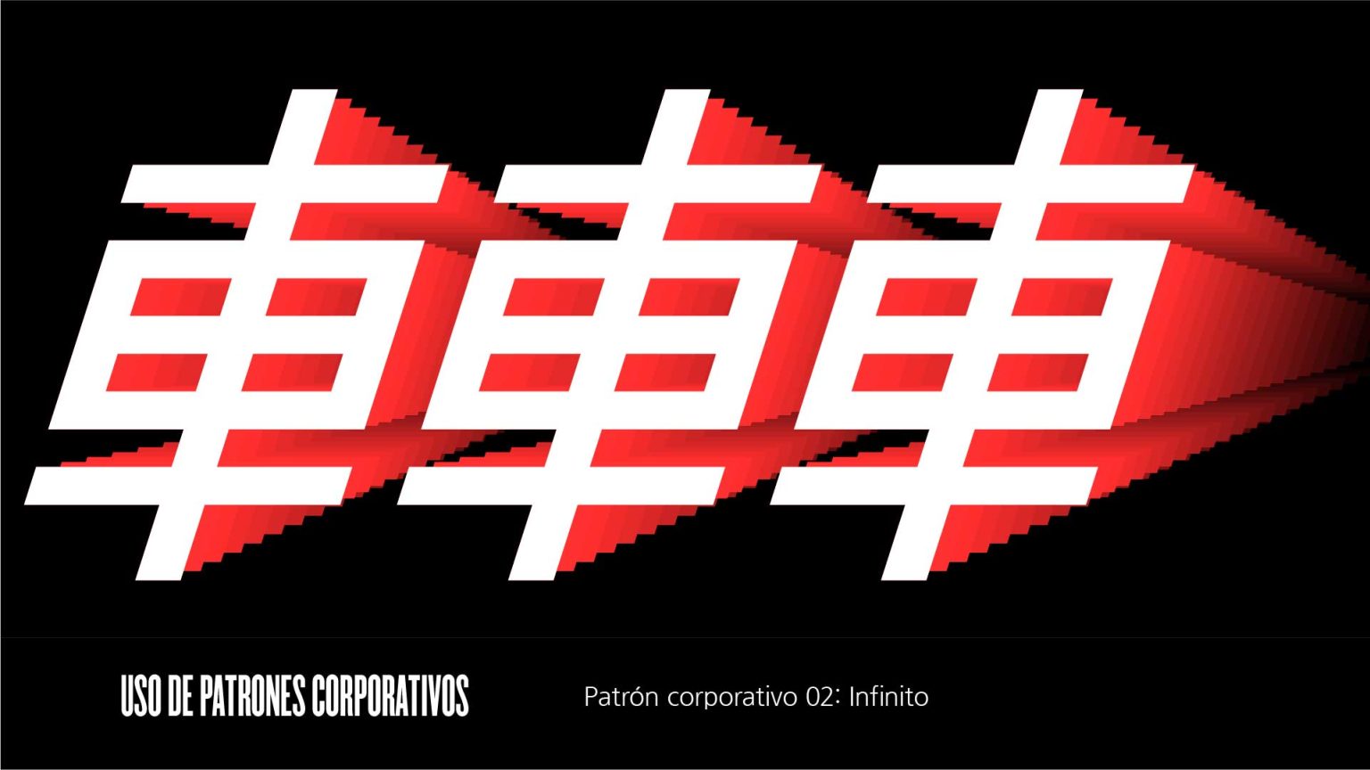
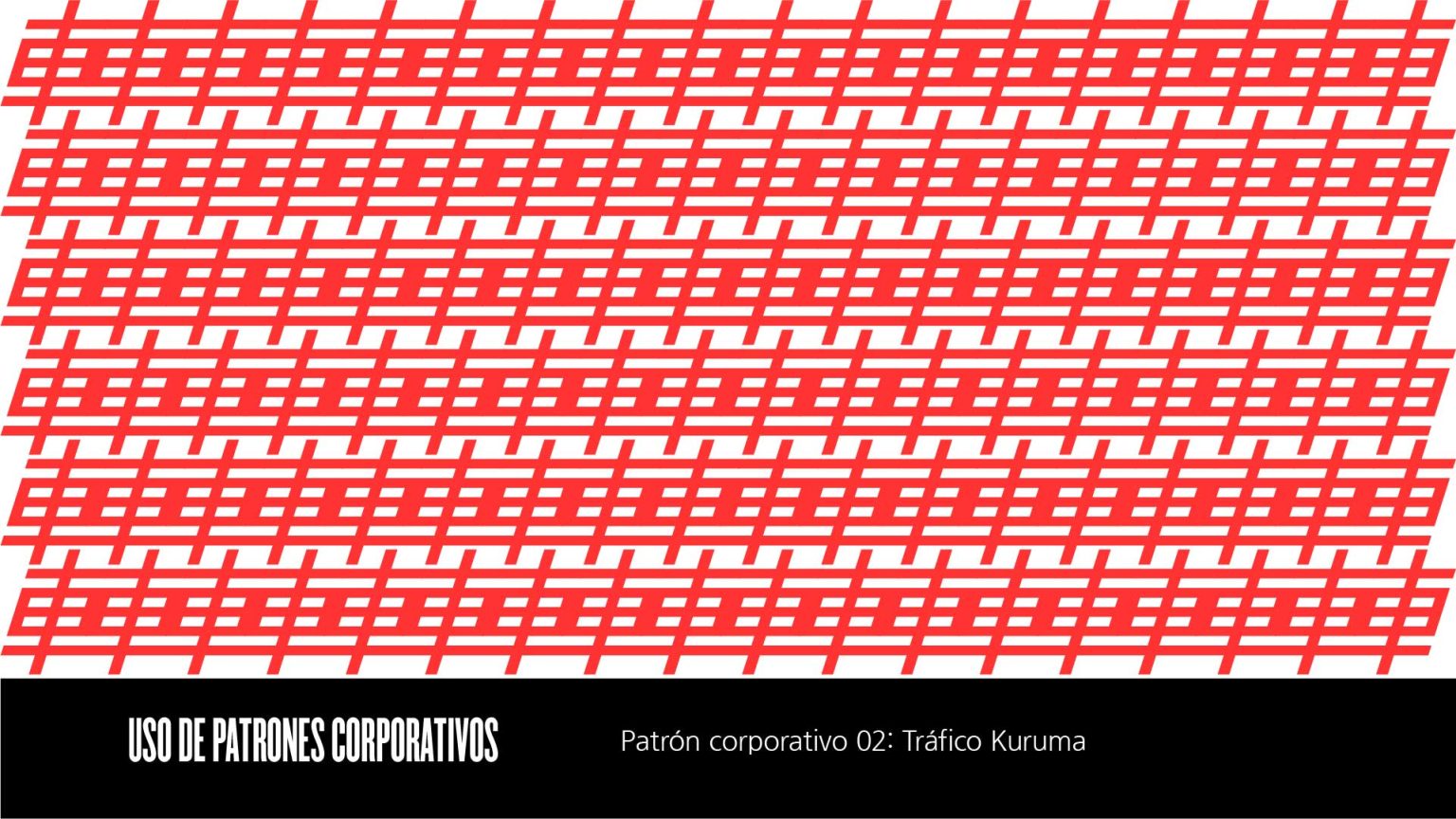
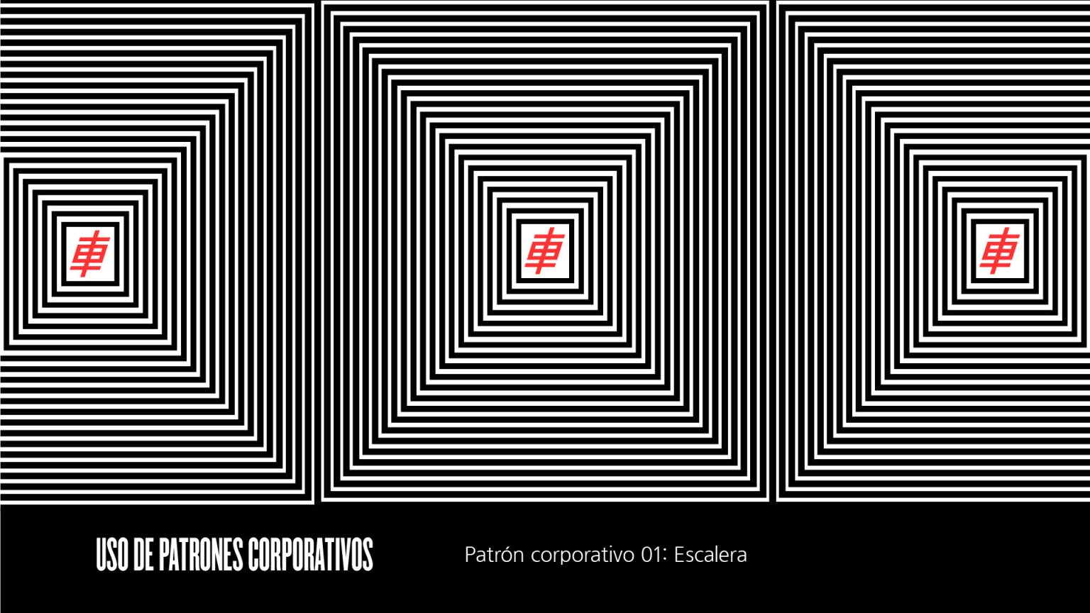
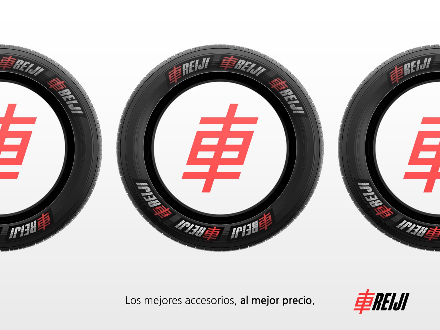
Logo Design & Rationale: The final logo was the result of a strategic process to embody speed, masculinity, and youth. It uniquely combines the Kanji character for “car” or “vehicle” (車, Kuruma) with the angled name “REIJI” set at a dynamic 15-degree tilt. This angle was intentionally chosen to communicate a sense of motion and acceleration, directly aligning with the automotive world. The incorporation of the Kanji adds a distinctive and authentic touch, setting the brand apart in a competitive market. A secondary, simplified version was also created for versatile applications where a cleaner design is required.

Leave a Comment

Your email address will not be published. Required fields are marked *

Scroll to Top