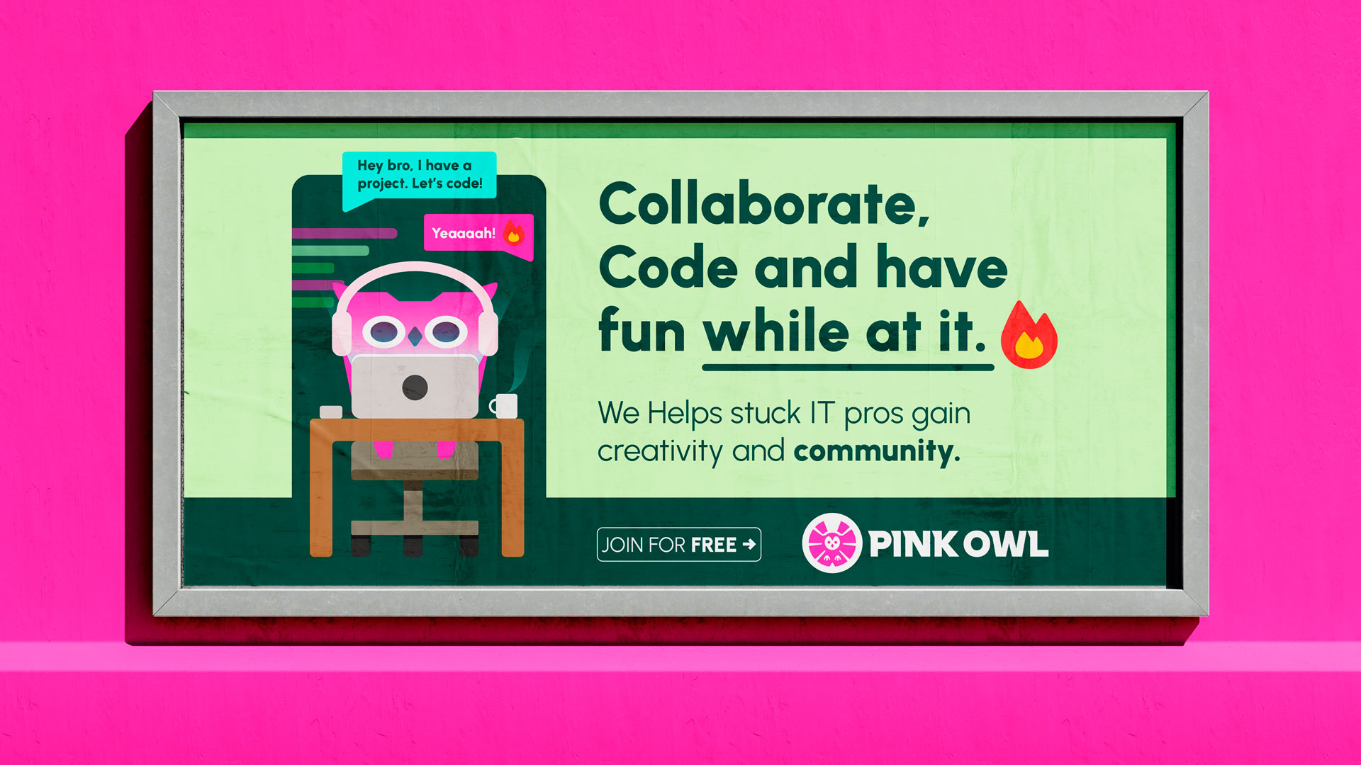
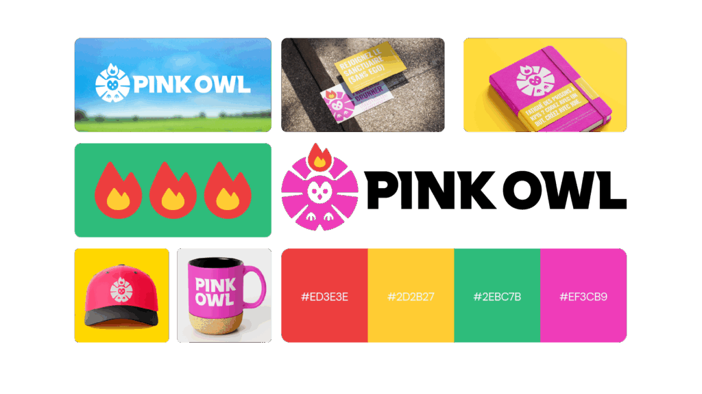
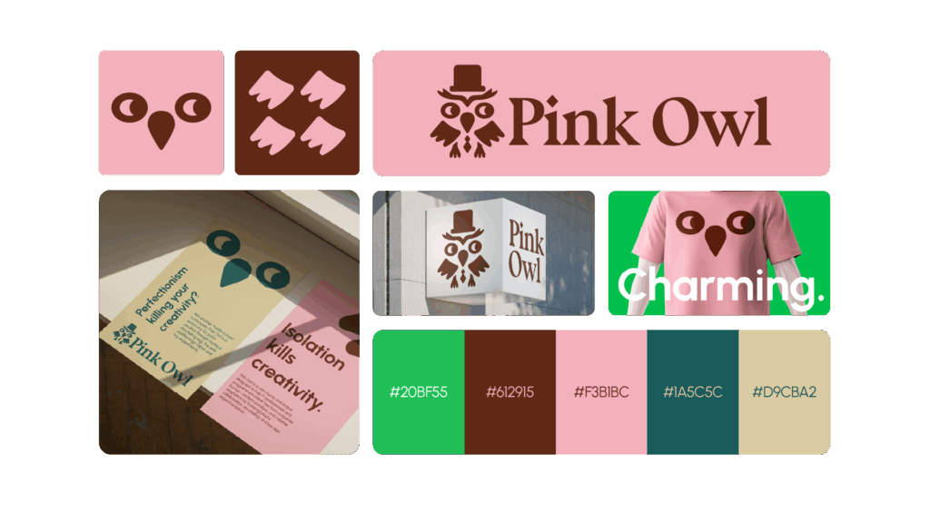
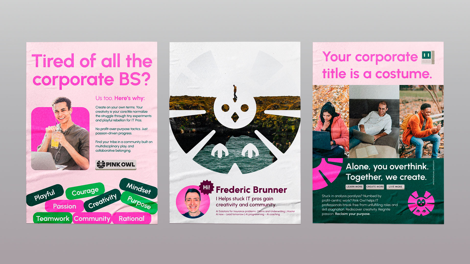
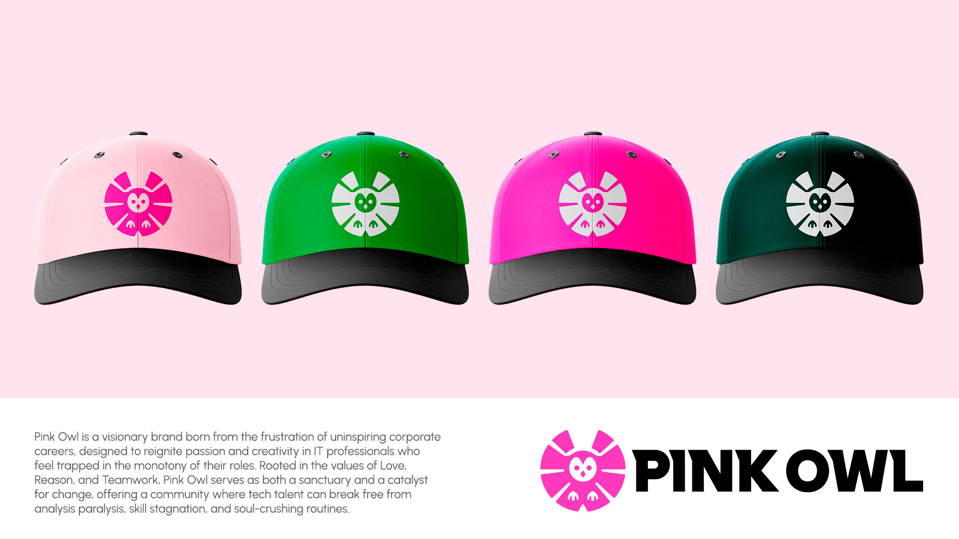
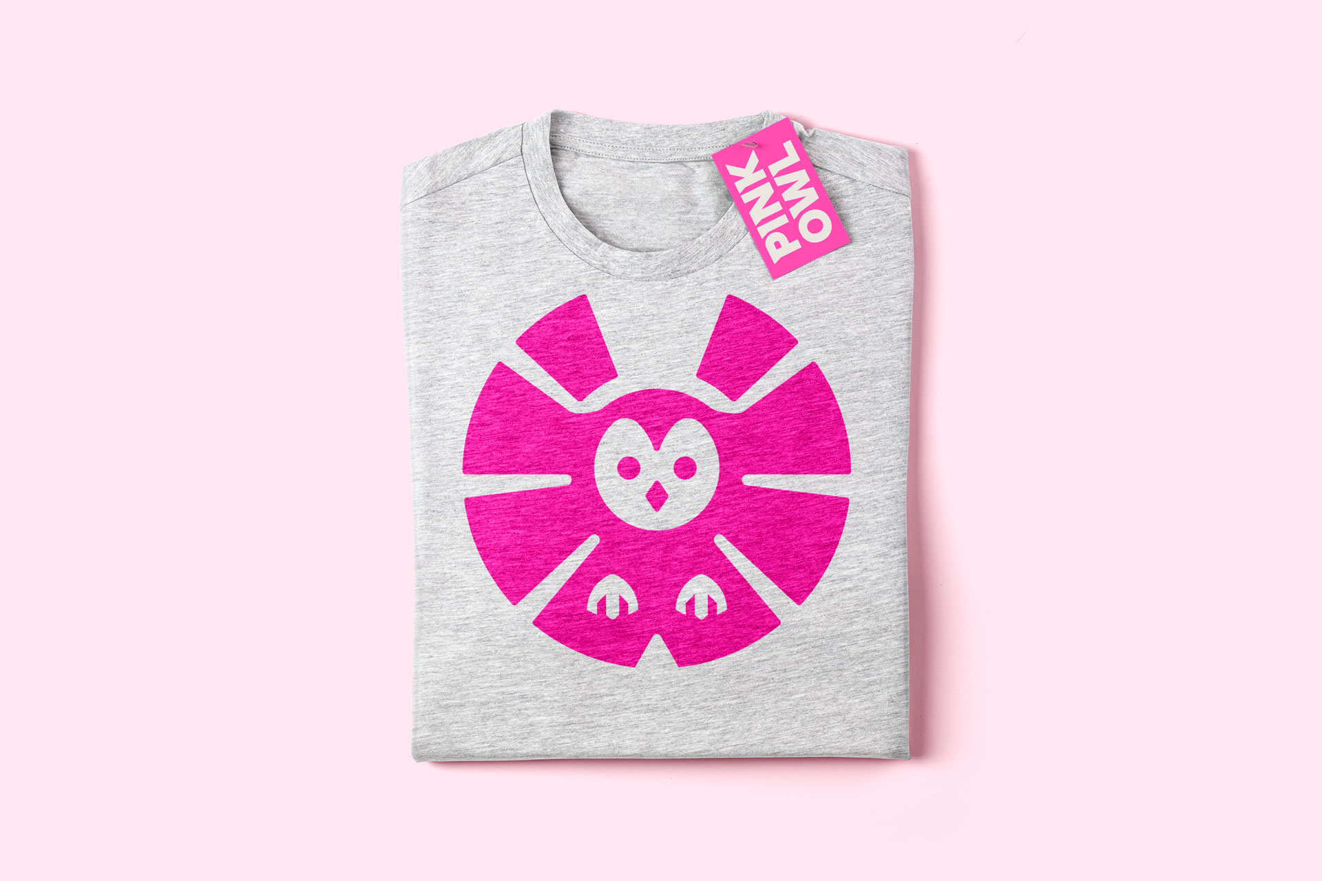
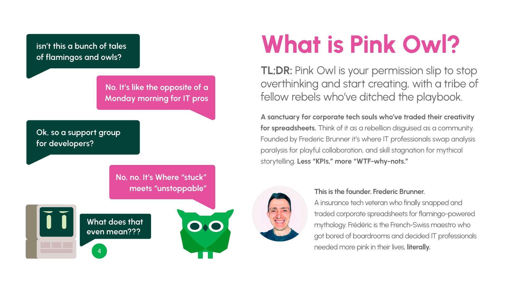
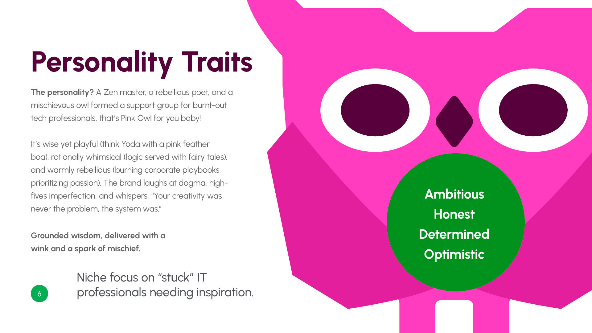
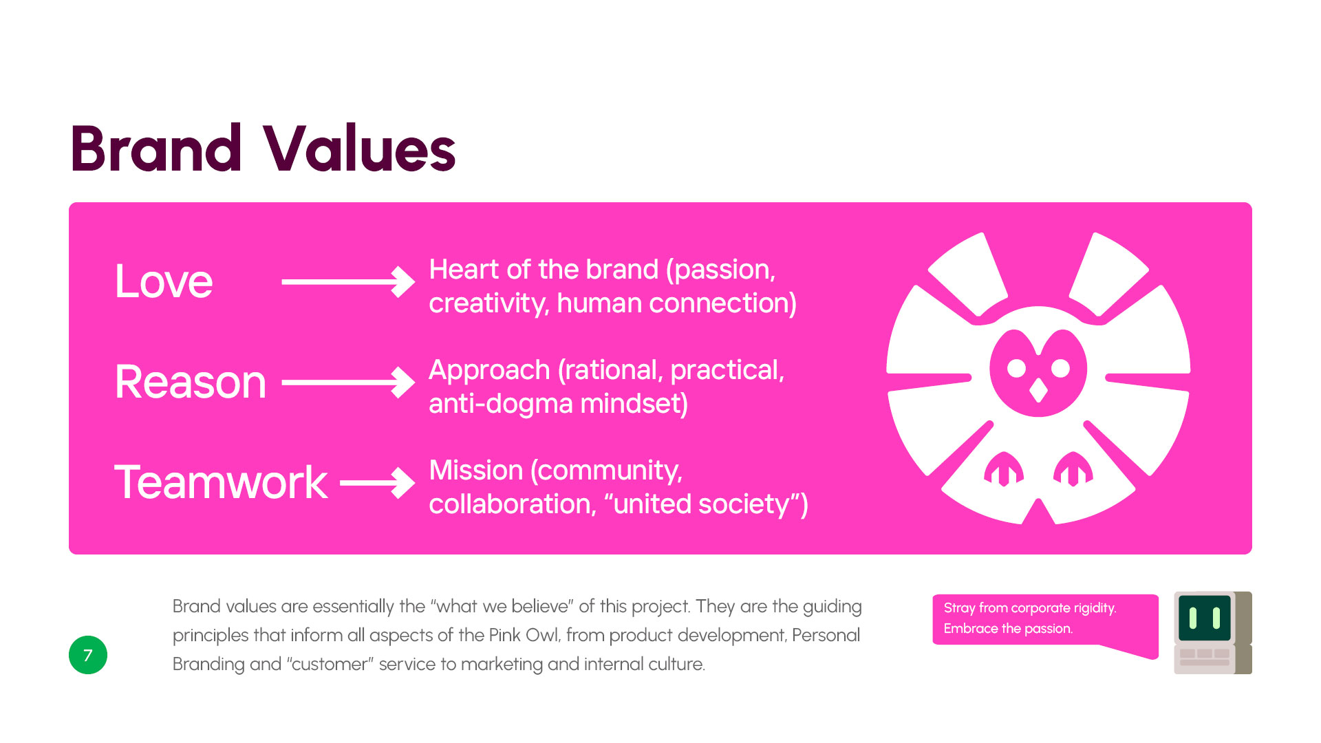
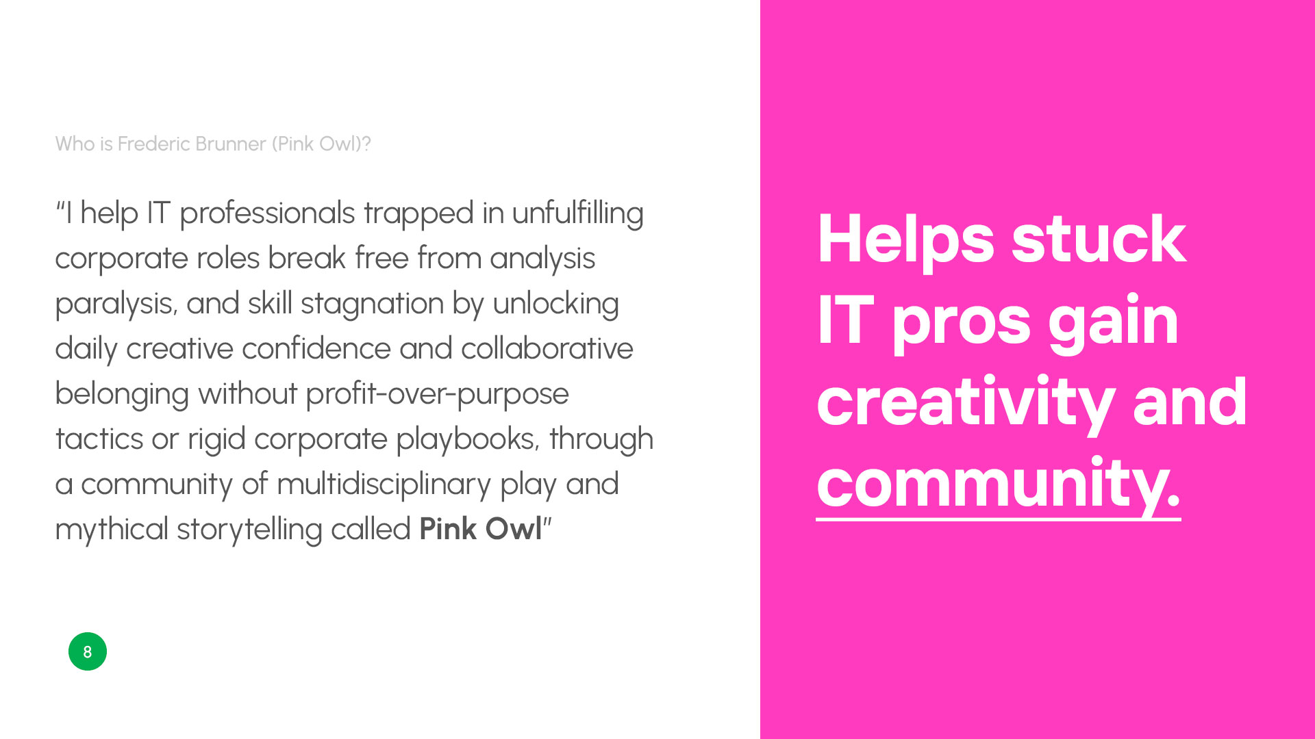
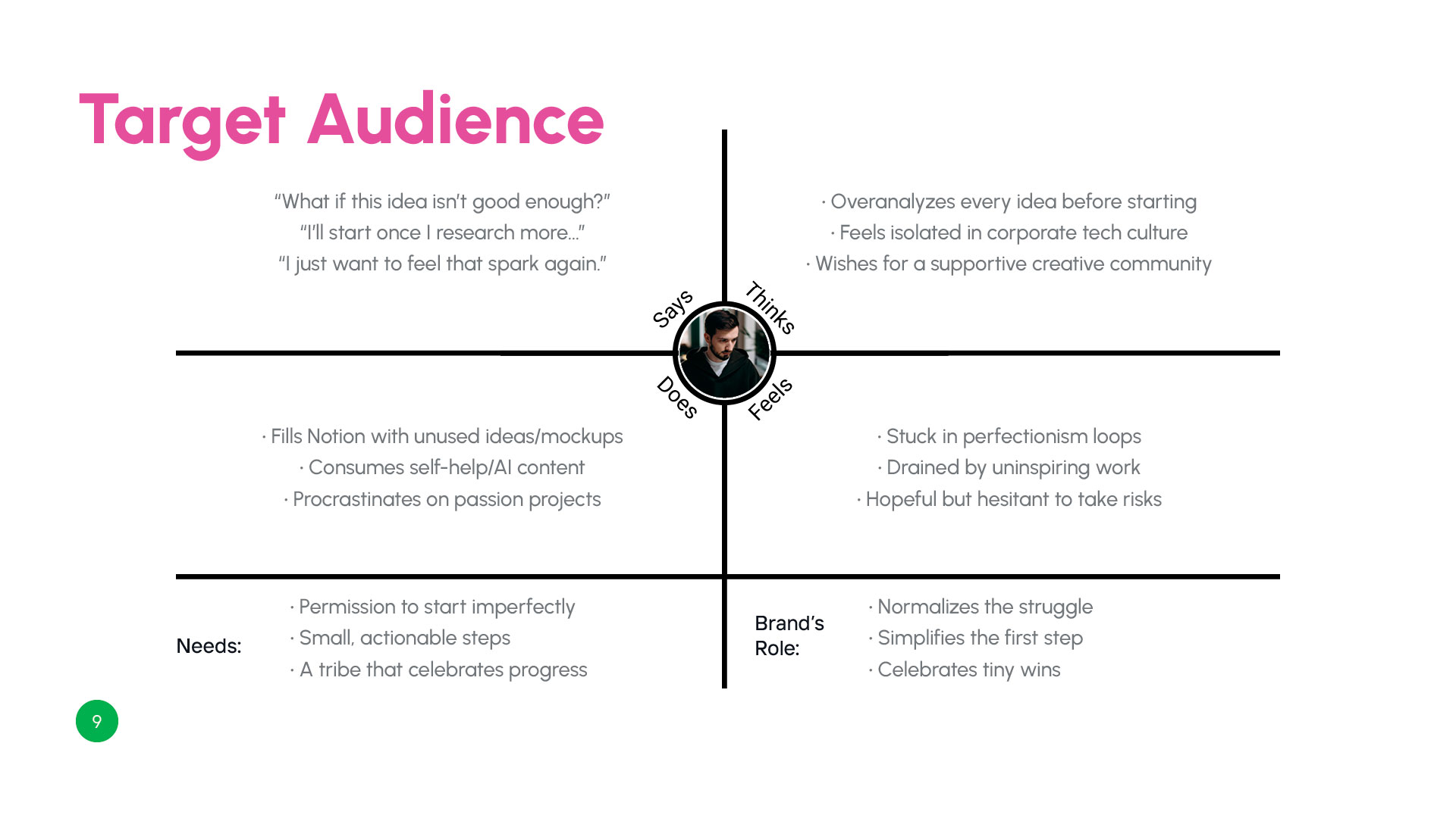
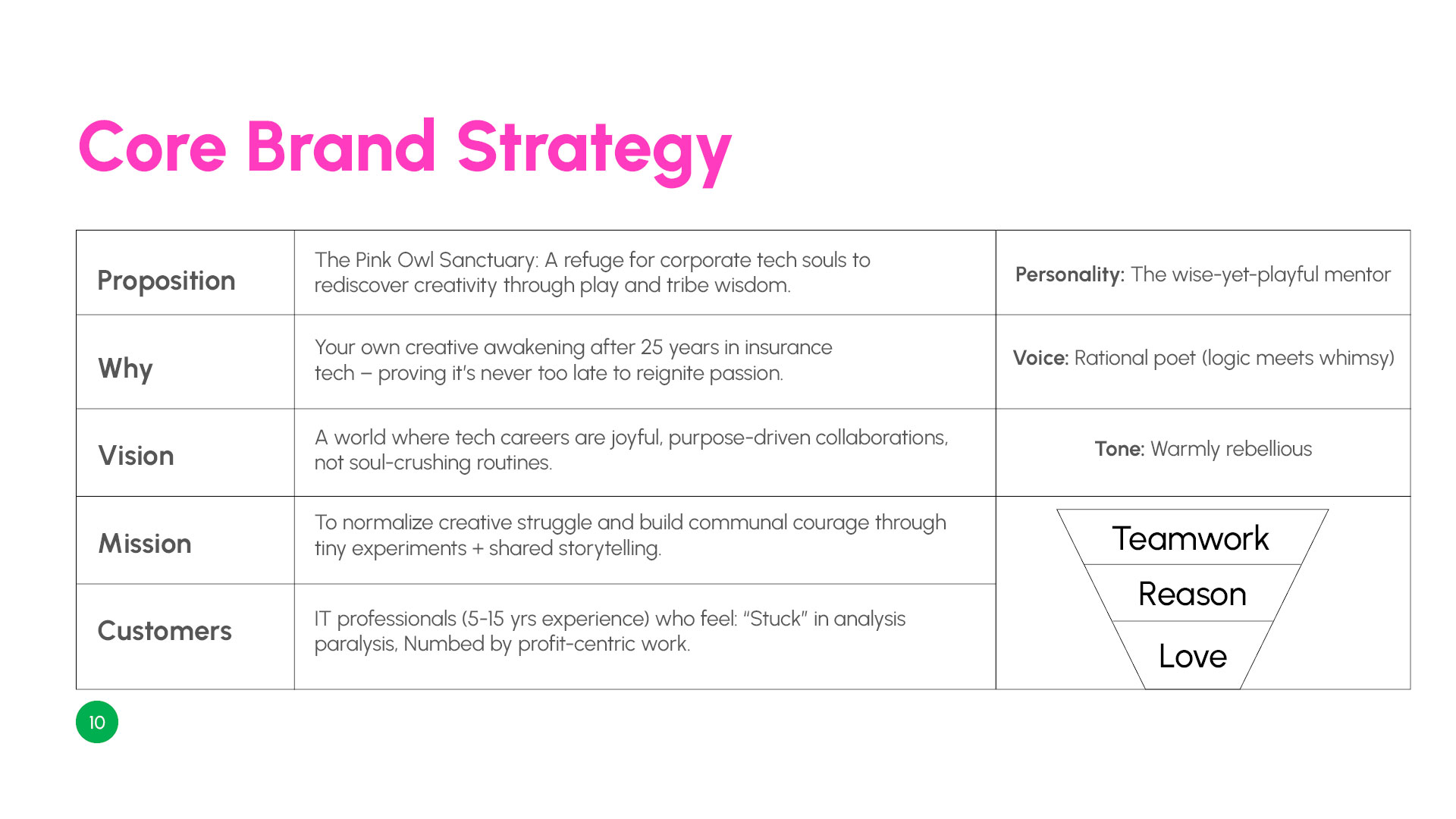
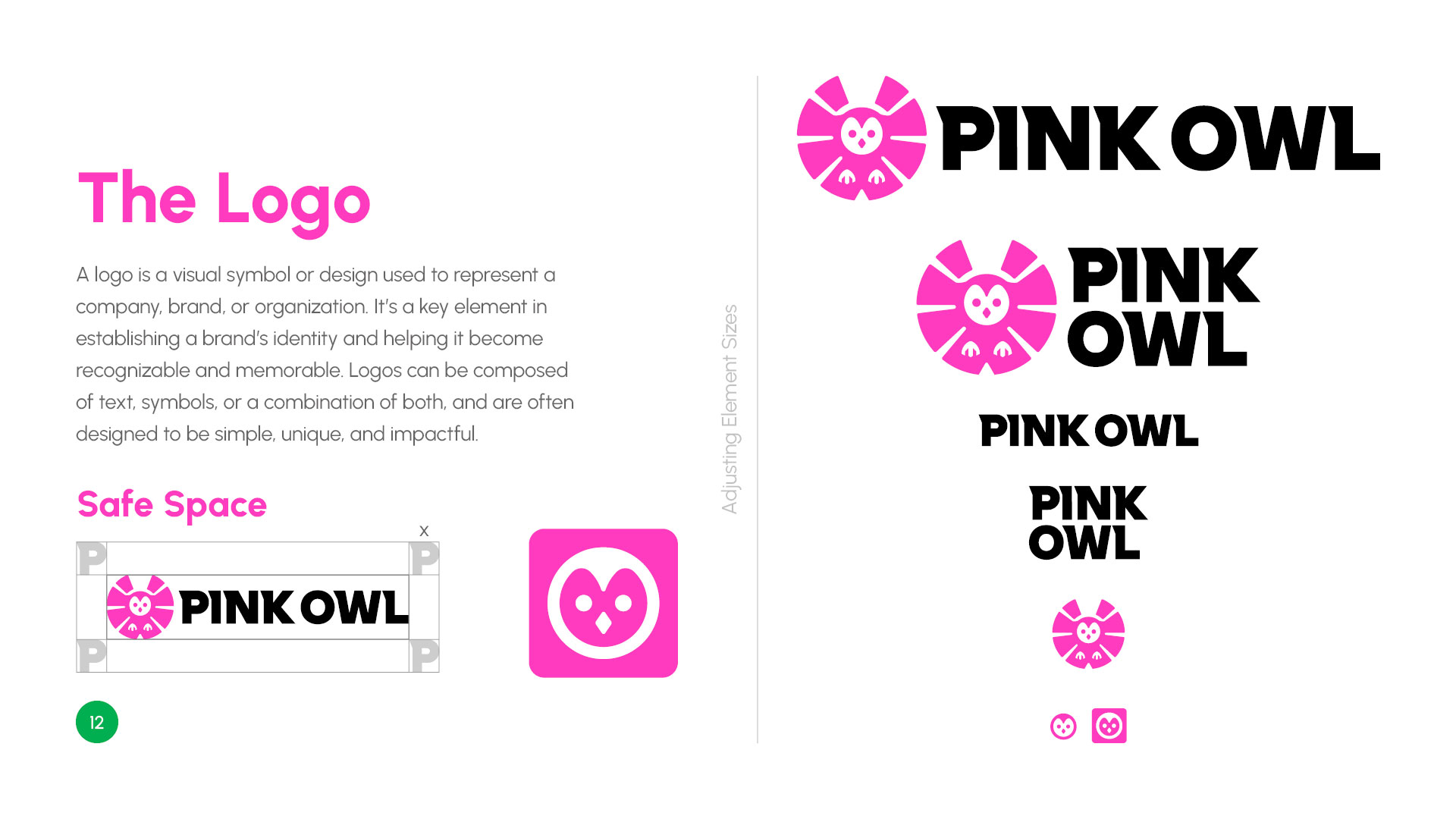
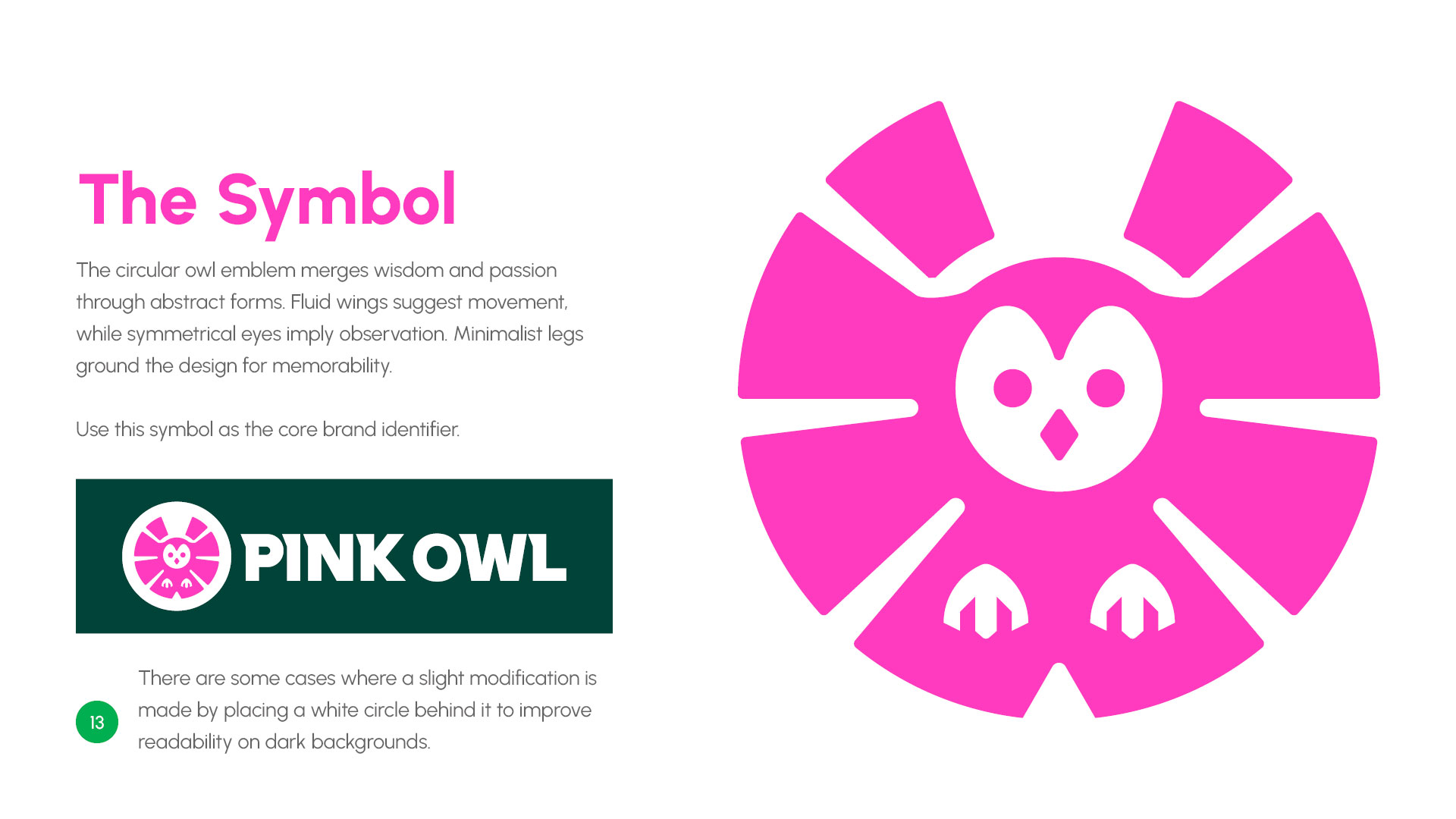
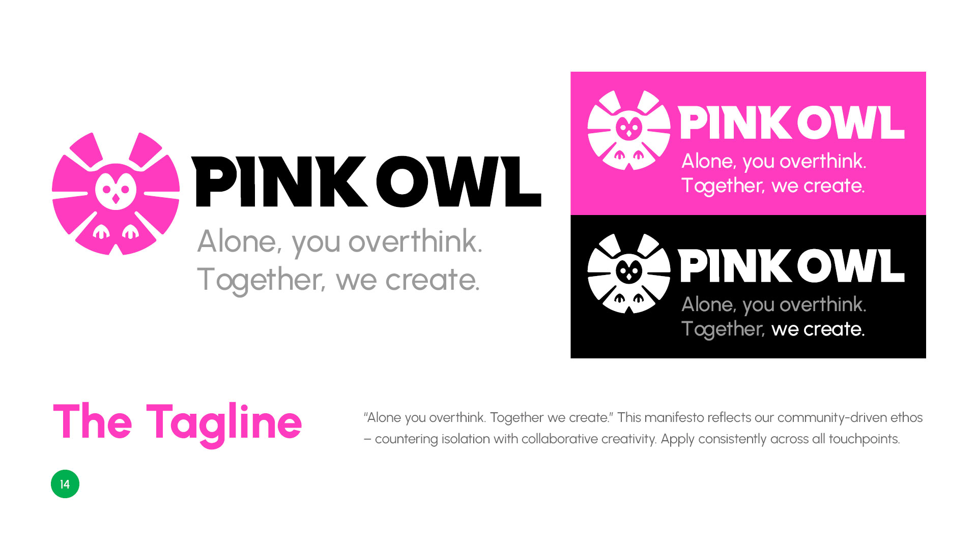
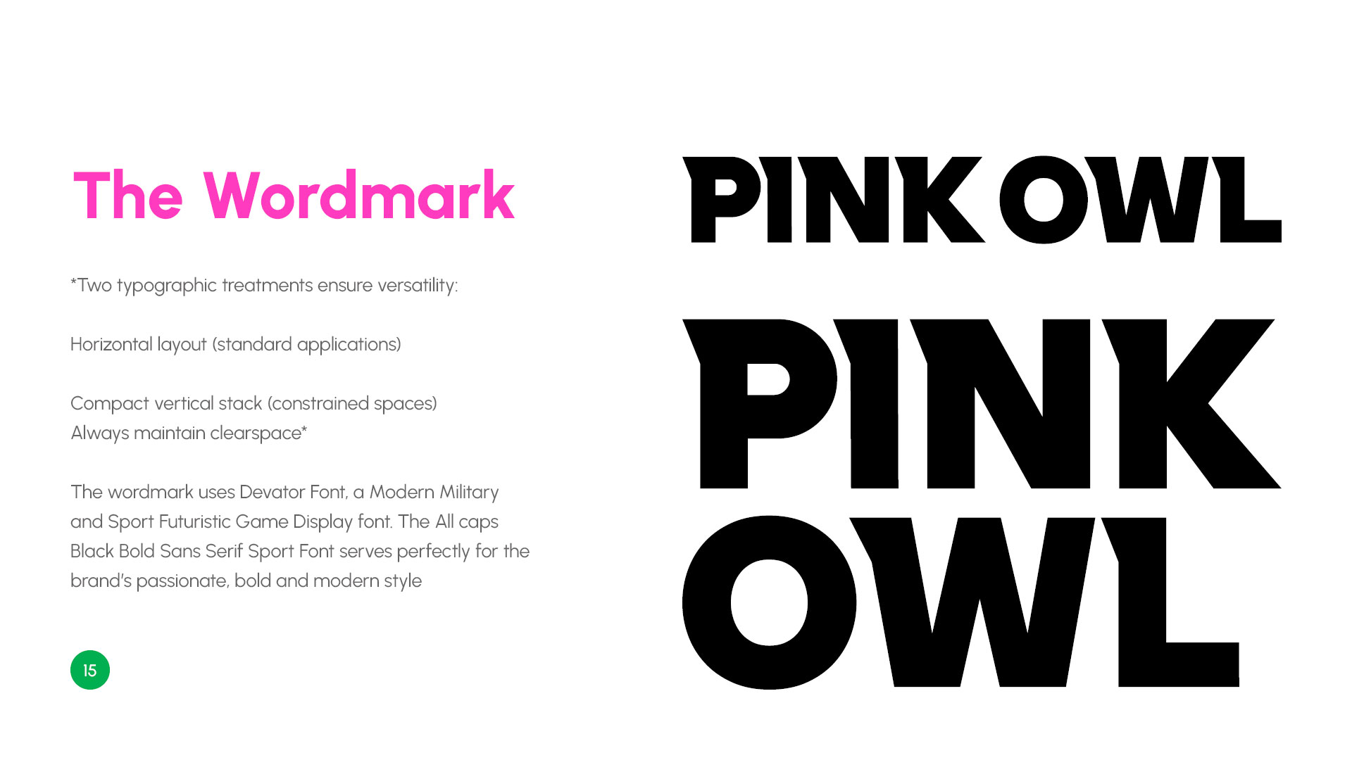
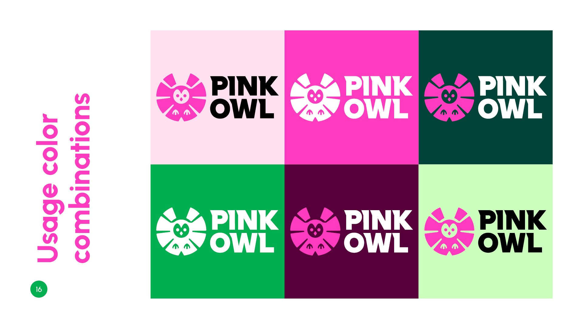
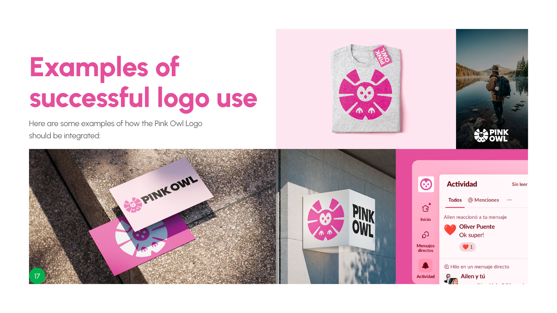
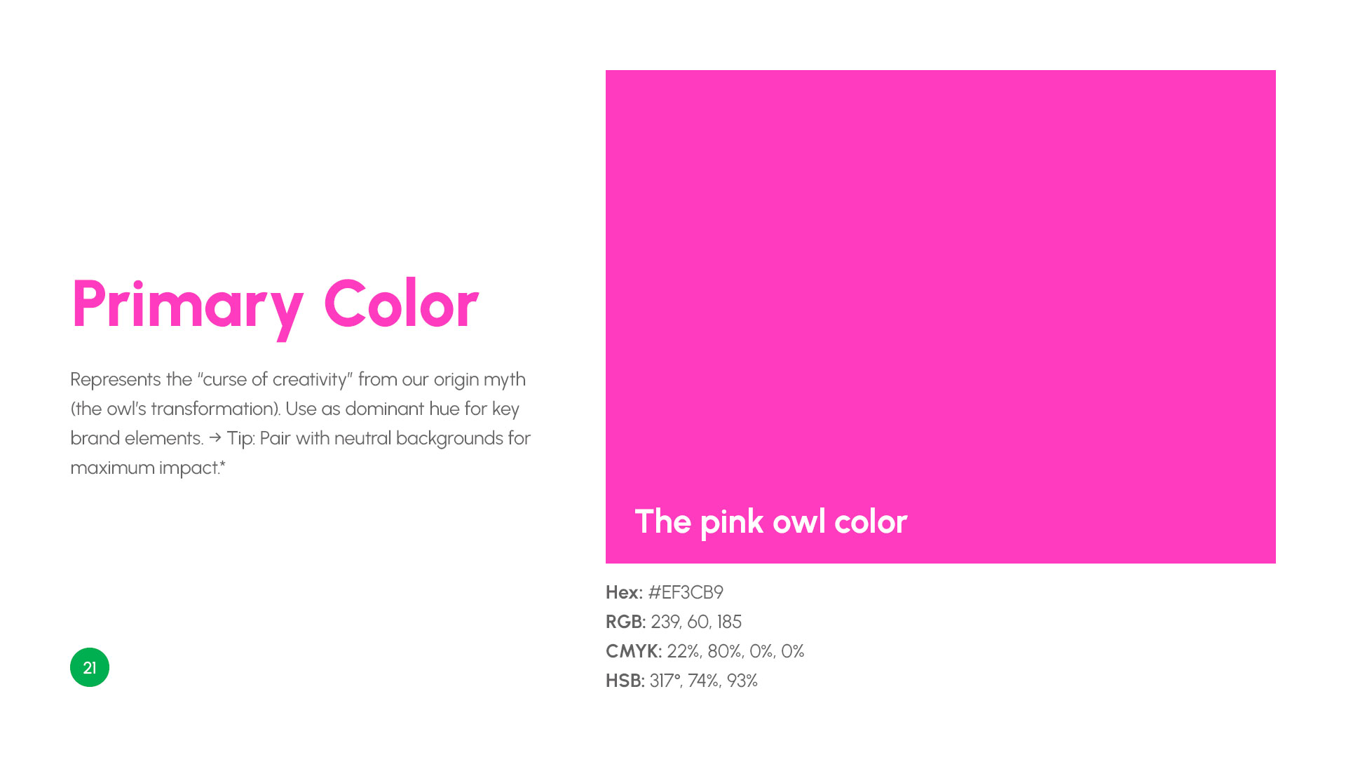
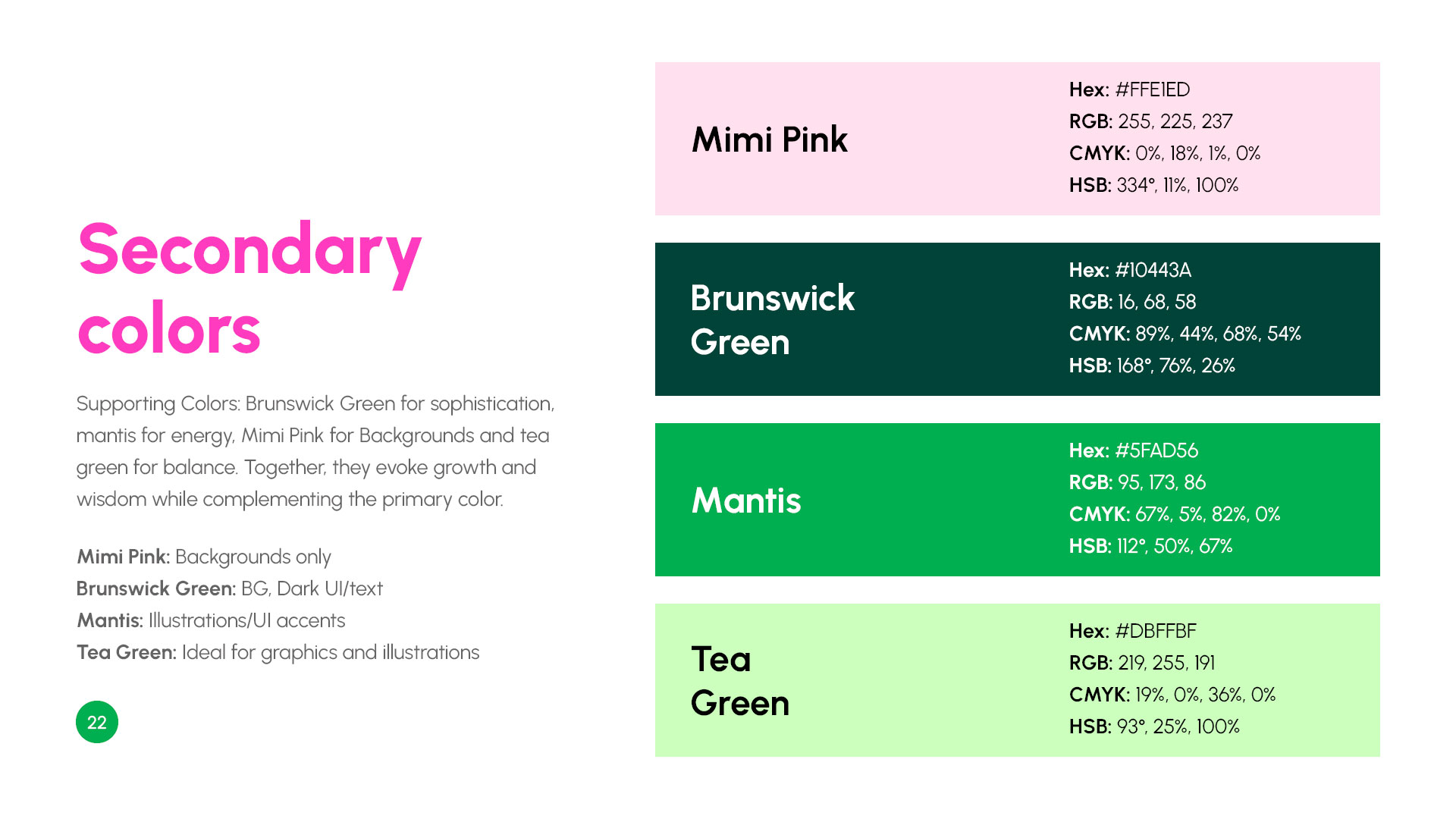
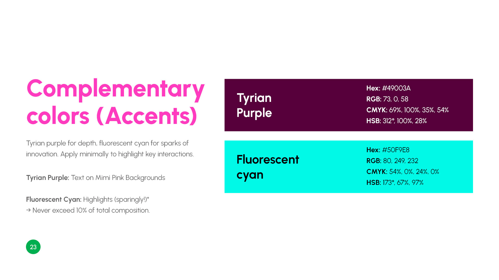
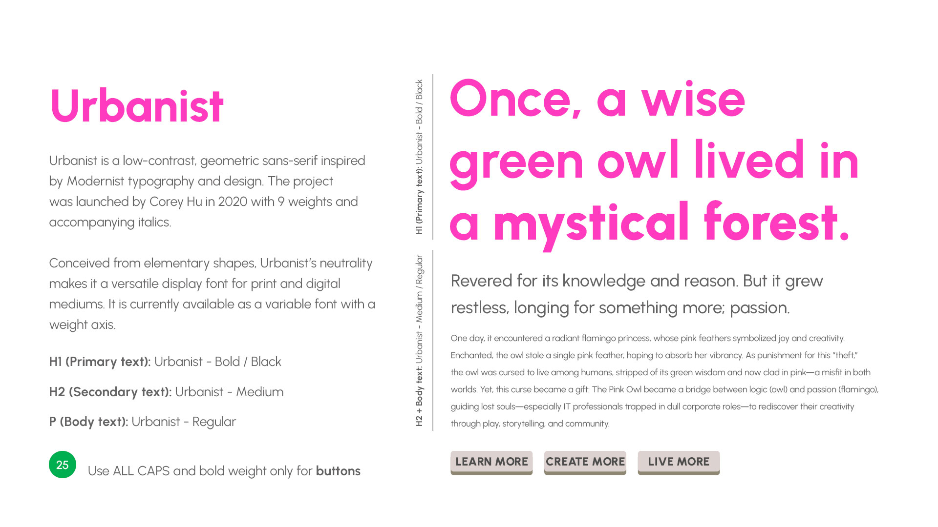
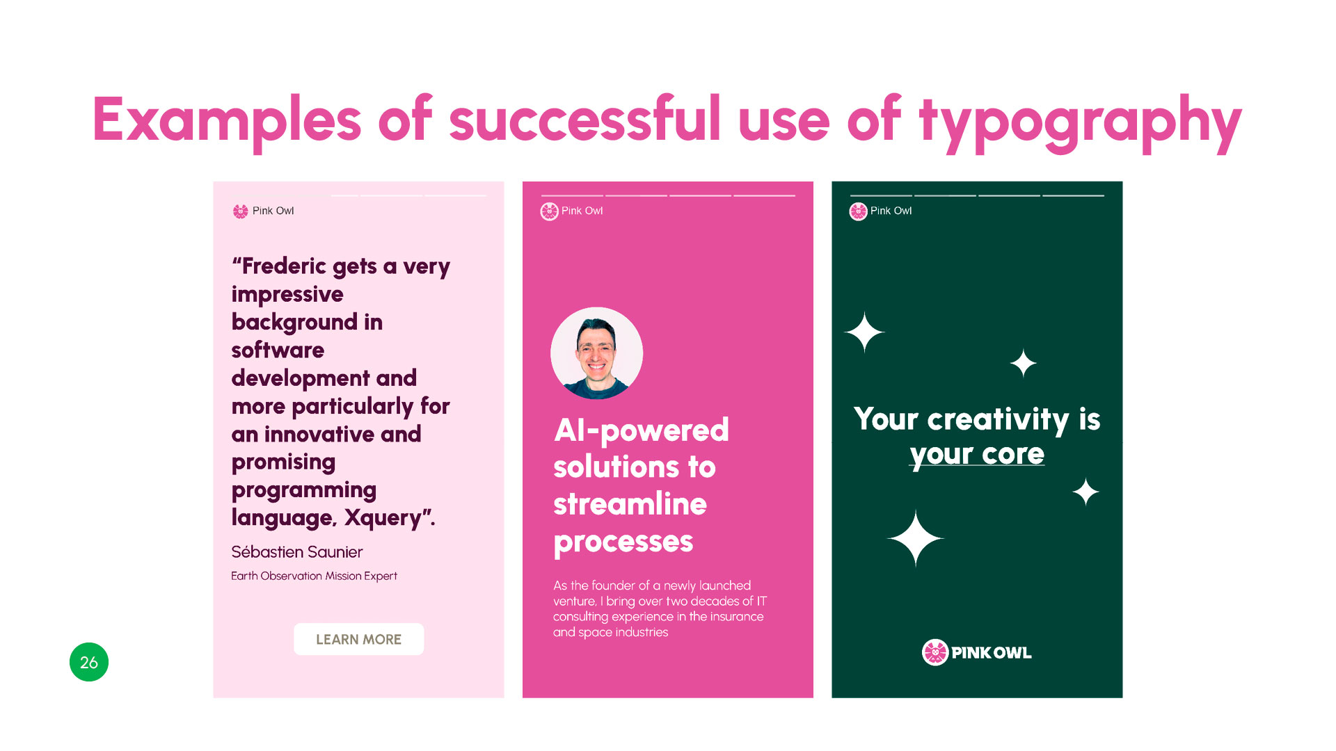
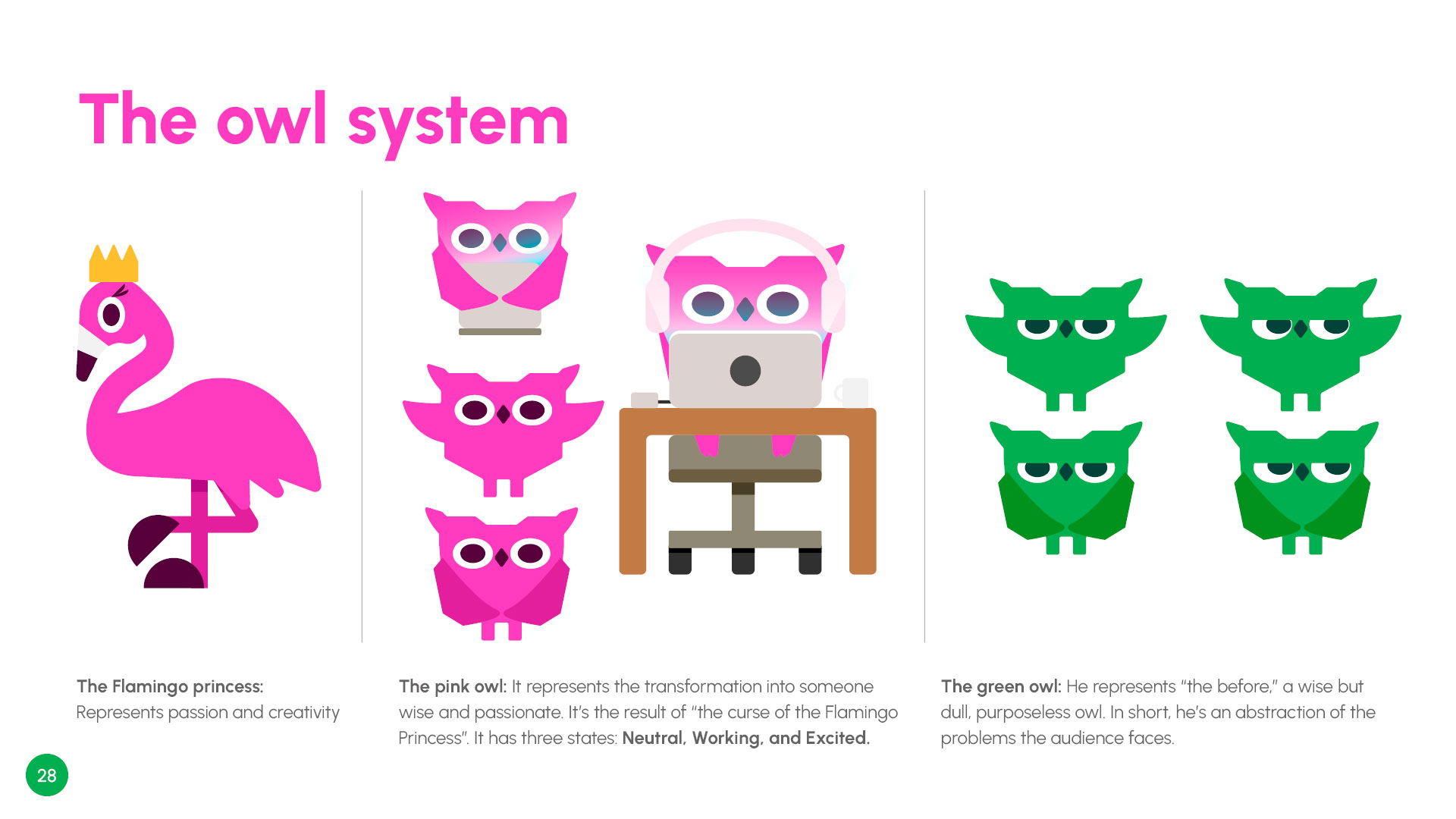
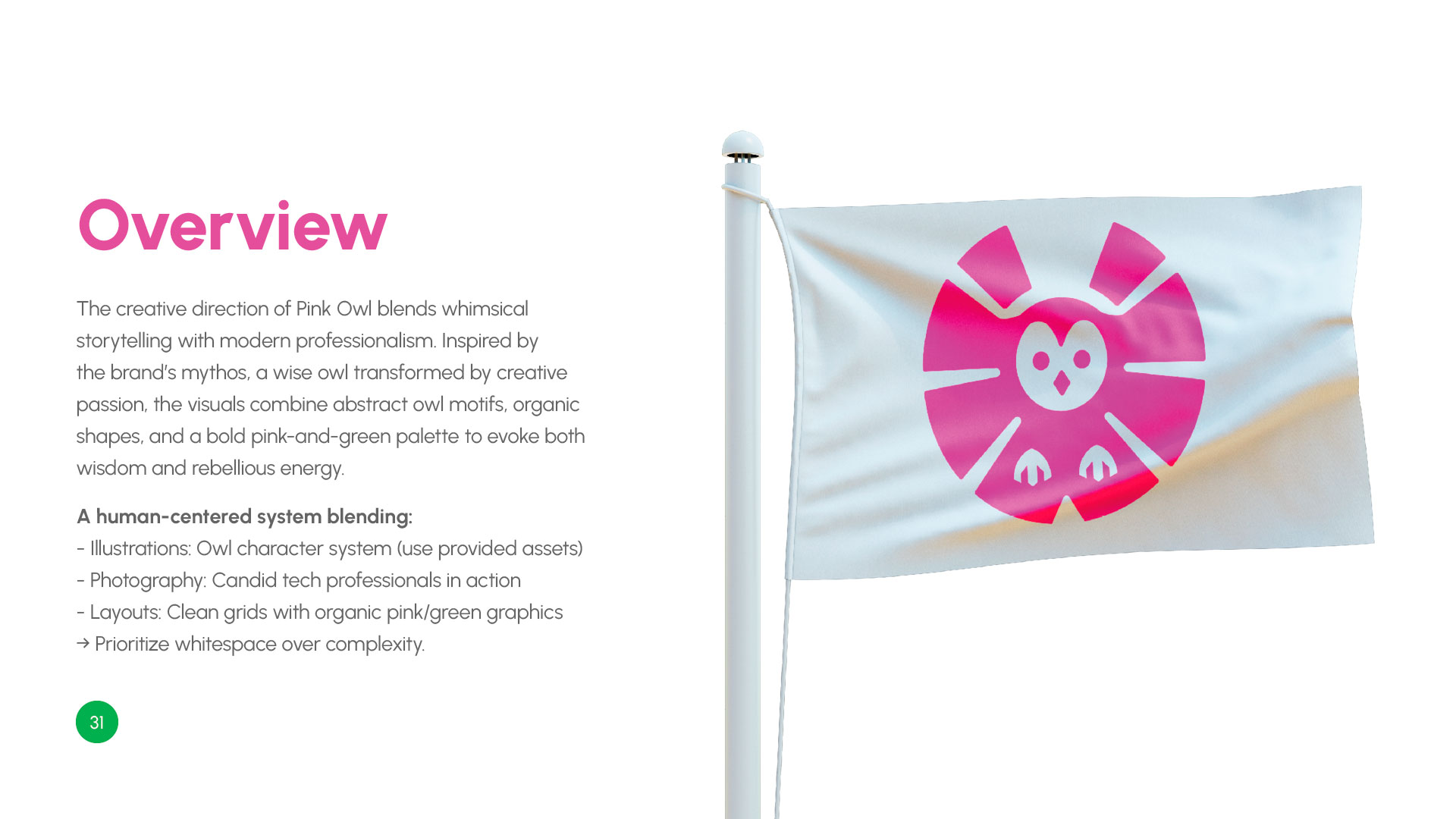
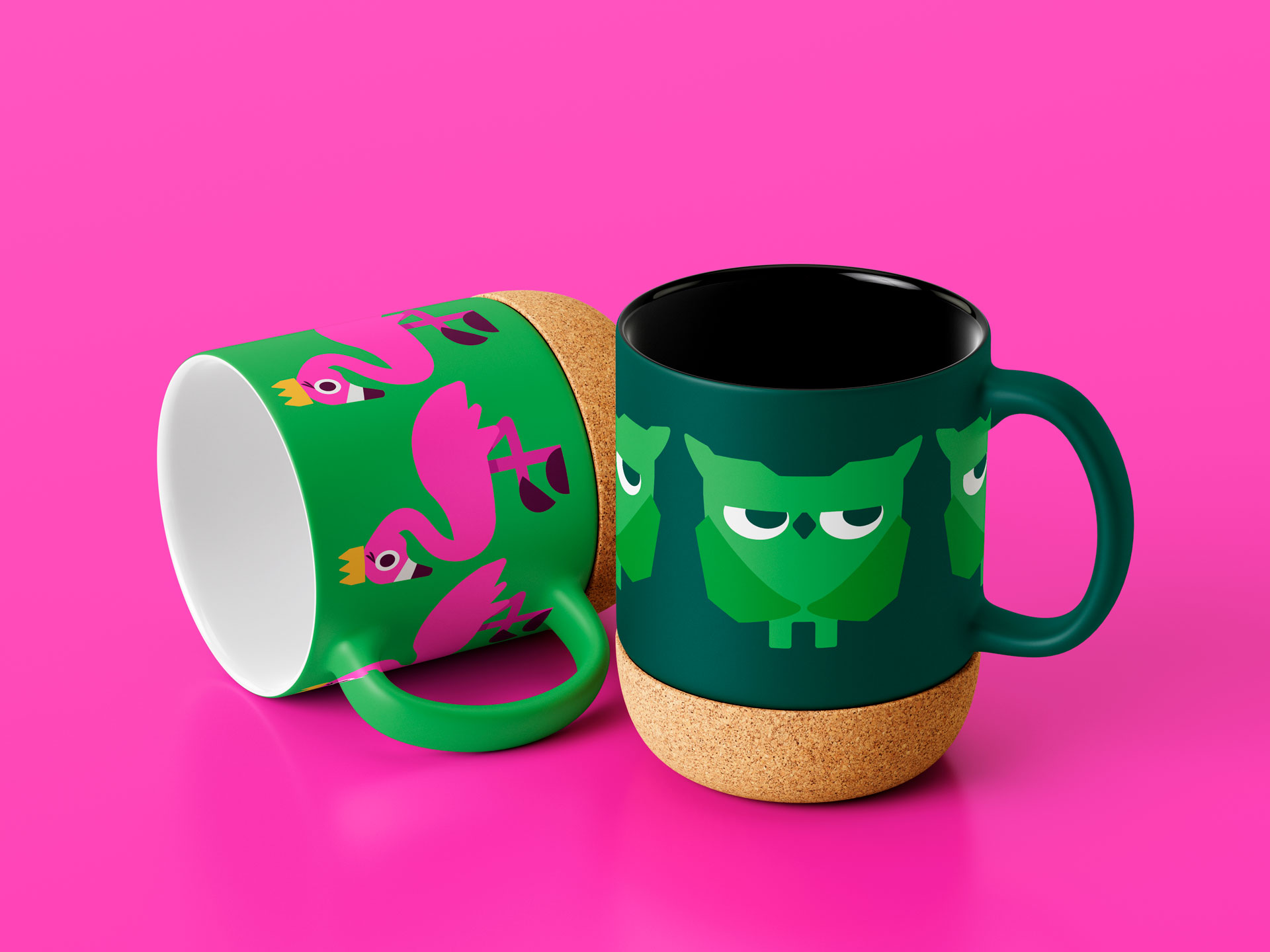
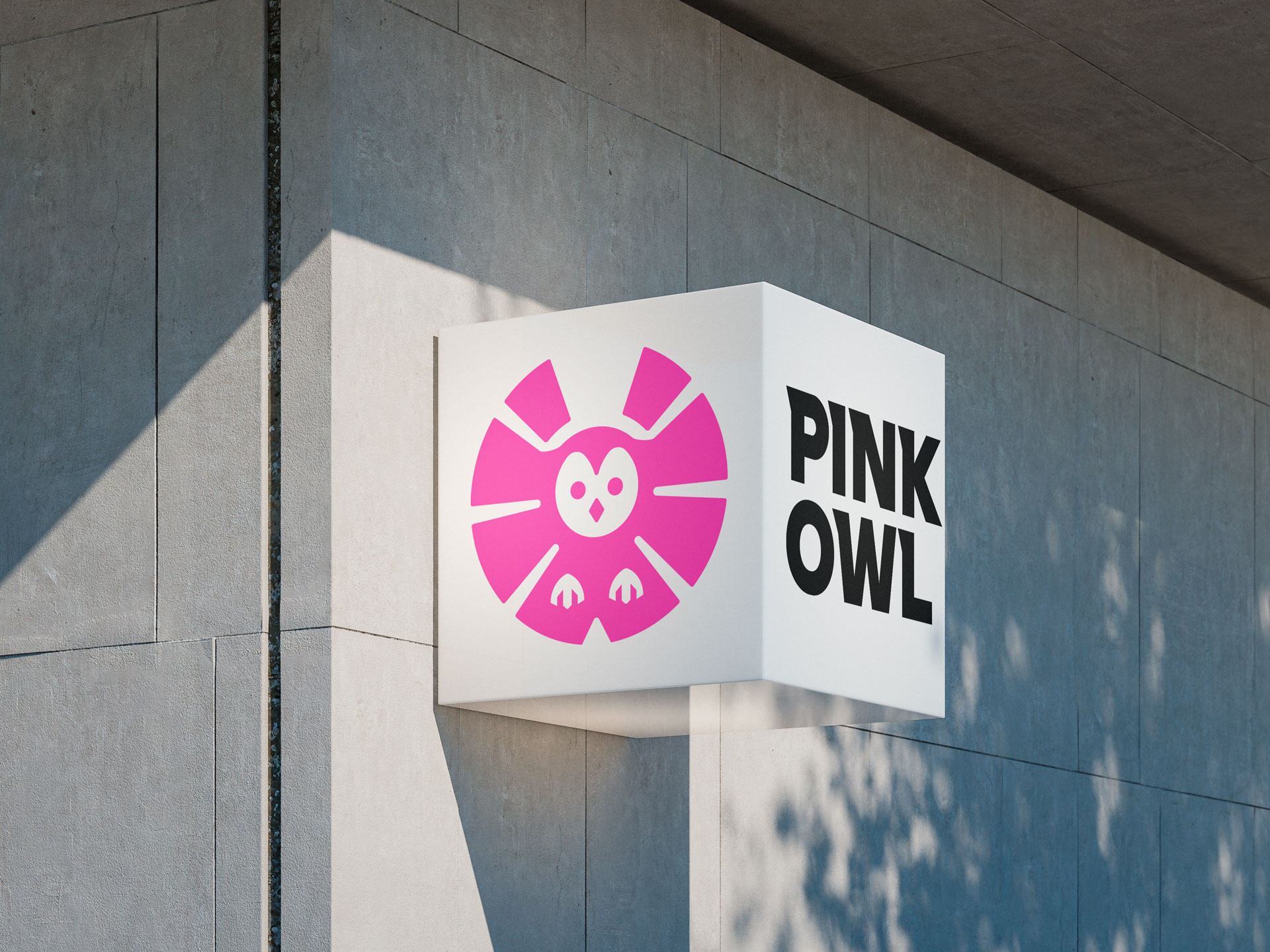
Pink Owl, a personal brand for a veteran IT professional, sought to create a sanctuary for other tech workers feeling trapped in unfulfilling corporate roles. The founder needed an identity that was the antithesis of corporate rigidity—something that felt like a “creative rebellion.” The challenge was to balance wisdom and whimsy, logic and passion. The resulting brand identity is built around a bold, abstract owl symbol, a vibrant pink-and-green palette, and a “warmly rebellious” voice, creating a cohesive system that acts as a rallying point for a community built on collaboration over competition.